A design system that speeds up product updates
From scattered components and slow handoffs to a cohesive system that accelerates shipping and aligns teams.
This case study was completed under NDA. Identifying details have been anonymized; performance metrics shown are accurate.
Context
When I began using what was called the company “design system”, I quickly realized it lacked the structure and systematic thinking that makes a true design system effective.
Rather than simply working around these limitations, I documented my observations and shared insights from my previous design system experience with leadership. I outlined the gap between our current state and what a mature design system could enable: faster product development, consistent user experiences and reduced design debt. My analysis and strategic vision for transformation led to me being selected as the Design System Manager.
Challenge
Taking on design system leadership meant confronting several systemic issues that were slowing the entire product delivery process.
Inconsistent design language
Design elements varied significantly across products and teams. Similar components had different behaviors, spacing and visual treatments, creating a disjointed experience and eroding brand consistency. Without a single source of truth, every designer was reinventing solutions that already existed elsewhere.
Development inefficiency
The lack of reusable, well-documented components meant developers were building the same elements repeatedly. Simple UI updates required disproportionate engineering effort, and each team was solving identical problems in isolation.
Designer-developer disconnect
Handoff was full of friction. Designers created mockups without understanding technical constraints, while developers implemented components without design context, leading to inconsistent implementations and endless revision cycles.
No shared language or guidelines
What one team called a “modal” another called a “dialog”. Design decisions were made in silos without documented rationale, which made it hard for new team members to understand why things worked the way they did, only what currently existed.
Product setup
- 1 Design System Manager (me)
- 1 Principal Engineer
- 1 UX/UI Designer
- 5 core front-end developers
- Multiple contributors
Co-leading with engineering
I co-led the design system with our Principal Engineer. We each owned an area, but we made an effort to take part in each other’s decisions so we would not work in silos.
Led by design
- Design language and token semantics
- Accessibility standards
- Figma library and usage guidelines
- Adoption across design teams and support
Decided together
- Component architecture
- Roadmap and priorities
- Component API decisions
- Contribution model and governance
- Definition of done
Led by engineering
- Token build pipeline
- Release process
- Storybook and the code library
- Adoption across development teams and support
A component was not finished until it existed in Figma, worked in Storybook and passed accessibility checks, and both of us had to sign off.
Design system architecture
Design tokens and automation
Together with our Principal Engineer, I defined a token-based architecture that serves as the single source of truth for all design decisions. Colors, typography, spacing, elevation and other foundations are defined once and propagate automatically across platforms and products, so global updates no longer mean component-by-component work.
Accessibility-first foundation
Rather than treating accessibility as a compliance checkbox, we embedded WCAG standards into the core of every component and pattern. Color contrast, keyboard navigation, screen reader support and focus management are validated at component level, so accessible design is the default, not an afterthought.
Component library and documentation
We built a library of standardized, reusable components in both Figma and Storybook. Each one includes usage guidelines, interaction patterns, accessibility considerations and implementation standards, so designers and developers work from the same source of truth.
Handoff and open-source push
As part of an organization restructuring, we led the effort to prepare a full handoff of the system to another team, so the work would continue after the company closed. That meant documenting every component, decision and usage guideline so the receiving team could run with it without us. In parallel, we advocated open-sourcing the Figma component library, following the development library that was already open source.
Impact and lessons learned
The design system transformation delivered measurable improvements across the organization.
- Accelerated development. Design-to-development time decreased significantly. Teams leveraged standardized components instead of building custom UI, so developers could focus on product logic.
- High adoption. The design system became the default starting point for all product work. Designers and developers both contributed to its evolution.
- Improved user experience. Consistent patterns reduced cognitive load across products, and WCAG compliance was built in by default, which removed retroactive accessibility audits.
- Enhanced collaboration. The shared language and documentation bridged the designer-developer gap. Both teams took part in design critiques and component evolution.
- Ready for AI. The system was being prepared for agentic AI, to automate and streamline our daily workflow.
Other projects
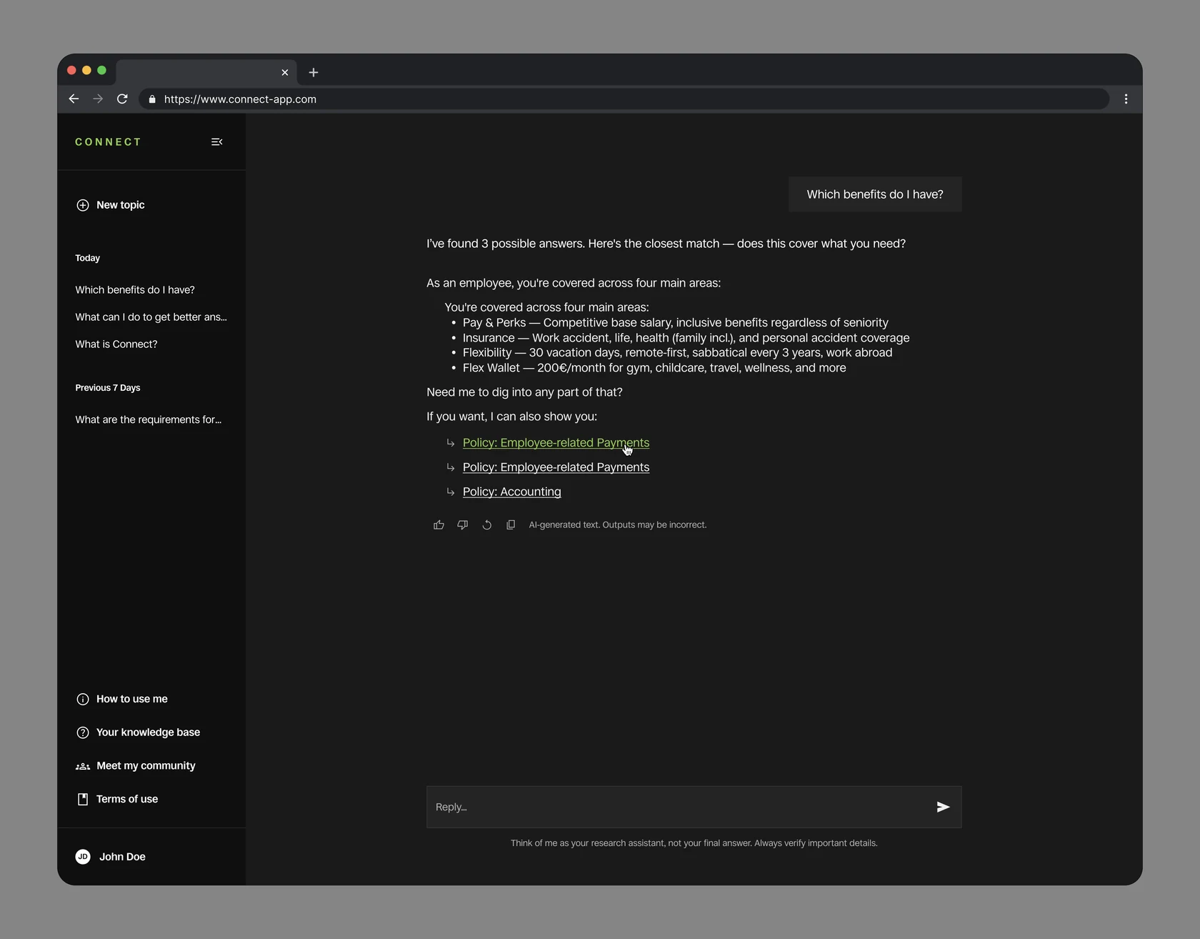
An internal AI assistant employees had stopped trusting
Turning a mandatory category picker into a system that answers with confidence.
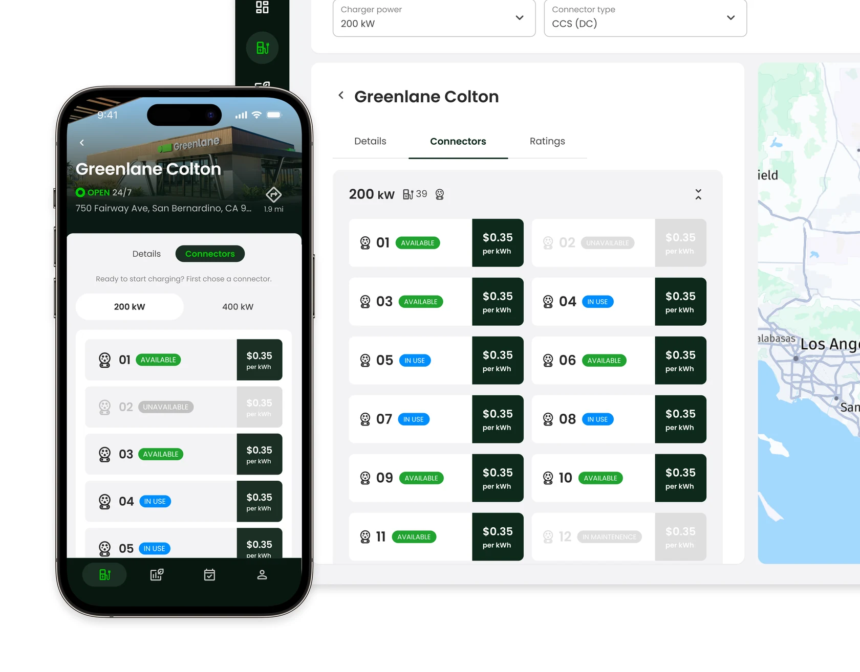
Two EV platforms launched on time with all key features intact in 10 months
Designing the technology foundation for electrifying commercial transportation of goods for two different users: fleet managers and truck drivers.